Sankey diagram software excel: While Excel offers basic charting capabilities, creating sophisticated Sankey diagrams within its confines proves challenging. This guide explores the limitations of Excel for this task and highlights the advantages of dedicated Sankey diagram software. We’ll delve into the process of data preparation, visualization techniques, and interpretation best practices, ultimately empowering you to leverage the power of Sankey diagrams for effective data communication.
We’ll examine several software options, comparing features, pricing, and ease of use, guiding you toward the best solution for your needs. Furthermore, we’ll address data handling complexities, including cleaning, transformation, and dealing with inconsistencies, ensuring your Sankey diagrams accurately reflect your data. The guide concludes with advanced techniques and alternatives to dedicated software, providing a complete overview of this powerful visualization method.
Introduction to Sankey Diagrams
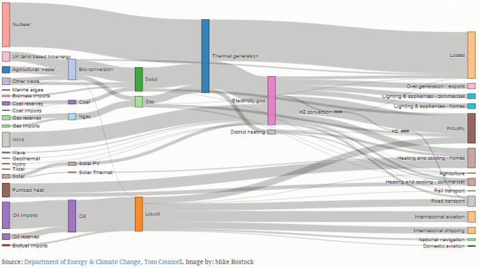
Sankey diagrams are a powerful visualization tool used to depict the flow of quantities between different stages or categories. They are particularly useful for showcasing energy, material, or financial flows, allowing for a quick and intuitive understanding of complex systems. Their strength lies in their ability to clearly represent both the magnitude and direction of these flows.
Sankey diagrams offer several key advantages over other visualization methods. Their visual clarity makes it easy to identify major contributors and recipients within a system, highlighting significant pathways and bottlenecks. The proportional width of the connecting links directly reflects the quantity being transferred, making it simple to compare the relative importance of different flows. This visual representation aids in quickly grasping the overall system dynamics and identifying areas requiring attention or further investigation. For example, in a manufacturing process, a Sankey diagram can clearly show where material loss occurs, pinpointing areas for optimization. In an energy analysis, it could illustrate the sources and destinations of energy consumption, revealing potential for efficiency improvements.
Key Components of a Sankey Diagram
A Sankey diagram consists of three fundamental components: nodes, links, and the width representation of the links. Nodes represent the different stages or categories involved in the flow. These are typically depicted as rectangles or boxes along the diagram’s edges. Links are the connecting lines between nodes, illustrating the flow of the quantity being measured. Crucially, the width of each link is directly proportional to the magnitude of the flow it represents; a wider link indicates a larger quantity being transferred. This proportional representation is the core of a Sankey diagram’s effectiveness. For instance, a Sankey diagram illustrating water usage might show nodes representing different household appliances (shower, toilet, washing machine) with the link widths reflecting the volume of water consumed by each.
Excel’s Limitations in Creating Sankey Diagrams
While Microsoft Excel is a powerful spreadsheet program, it’s not ideally suited for creating Sankey diagrams. Its inherent limitations become apparent when attempting to build complex visualizations, leading to frustration and potentially inaccurate representations of data. The lack of built-in Sankey diagram functionality necessitates significant workarounds, impacting both the efficiency and the visual appeal of the final product.
Creating a Sankey diagram in Excel requires considerable manual effort. Data needs to be meticulously organized and pre-processed to fit the constraints of Excel’s charting capabilities. This often involves creating numerous helper columns and employing complex formulas to calculate node positions and flow widths. The process is time-consuming and prone to errors, especially with larger datasets. Formatting the diagram to achieve a visually appealing and easily understandable result adds further complexity. Manually adjusting the width of each flow, positioning nodes precisely, and ensuring accurate labeling requires significant patience and attention to detail. Any changes to the underlying data necessitate a complete reformatting of the entire diagram.
Manual Data Manipulation and Formatting Challenges
The process of transforming raw data into a format suitable for a Sankey diagram within Excel is often cumbersome. For instance, if you have data representing energy flows between different sectors (e.g., electricity generation, transportation, industry), you’d need to carefully structure this data into a format that Excel’s charting tools can interpret. This could involve creating separate columns for source and target sectors, and corresponding flow values. Then, you’d need to manually calculate the coordinates of each node and the width of each connecting flow, based on the relative magnitudes of the flows. Furthermore, adjusting the appearance (colors, labels, etc.) of the diagram in Excel can be tedious and may not allow for the level of customization available in dedicated Sankey diagram software. Even small adjustments might necessitate recalculating coordinates and potentially redrawing significant portions of the diagram.
Ease of Use and Functionality Comparison
Dedicated Sankey diagram software offers a significant advantage over Excel in terms of ease of use and functionality. These specialized tools provide intuitive interfaces for importing data, configuring the diagram’s appearance, and automatically calculating node positions and flow widths. They often support interactive features, such as tooltips displaying detailed data on hover, and the ability to zoom and pan for better exploration of large diagrams. Furthermore, many offer export options in various formats (e.g., SVG, PNG) suitable for publication or presentations. In contrast, creating a comparable Sankey diagram in Excel is a significantly more laborious and error-prone process, often yielding a less visually appealing and less interactive result. For instance, a dedicated tool might automatically adjust node spacing and flow widths to prevent overlaps and ensure readability, while Excel would require manual adjustment, which can be incredibly time-consuming and prone to errors, particularly for larger, more complex diagrams.
Exploring Sankey Diagram Software Options
Source: schematron.org
While creating Sankey diagrams in Excel can be manageable for smaller datasets, more complex visualizations might require dedicated software. If you’re also working with animation, you might find resources like free cartoon making software for final cut cut helpful for integrating your Sankey diagram data into a broader animated presentation. Ultimately, the best approach depends on your specific needs and the complexity of your data.
Returning to Sankey diagrams, remember to choose software that suits your data volume and desired level of customization.
While Excel can create basic Sankey diagrams, its limitations become apparent when dealing with larger datasets or more complex visualizations. Dedicated Sankey diagram software offers significantly enhanced capabilities, providing a smoother workflow and more visually appealing results. This section explores several popular options and highlights their strengths.
Sankey Diagram Software Comparison
Choosing the right software depends on your specific needs and budget. The following table compares three popular options, considering features, pricing, and ease of use.
| Software Name | Key Features | Pricing Model | Ease of Use Rating |
|---|---|---|---|
| Gephi | Open-source, highly customizable, handles large datasets, supports various node and edge attributes, allows for interactive exploration. | Free | ★★★☆☆ (Moderate learning curve, powerful features) |
| SankeyMATIC | User-friendly interface, intuitive drag-and-drop functionality, supports various data formats, offers various customization options for visual appeal, cloud-based collaboration features. | Subscription-based (various tiers available) | ★★★★☆ (Easy to learn and use, especially for beginners) |
| Flourish | Web-based, visually appealing templates, easy data import, interactive visualizations, strong emphasis on data storytelling, collaborative features. | Freemium (limited free features, paid subscription for full access) | ★★★★☆ (User-friendly interface, great for creating visually compelling charts) |
Superior Features of Dedicated Sankey Diagram Software
Dedicated Sankey diagram software surpasses Excel in several key areas. The ability to handle significantly larger datasets with complex relationships is a major advantage. These tools often provide advanced features like interactive elements (allowing users to hover over nodes for detailed information), better customization options for visual aesthetics (including color palettes, node shapes, and edge thicknesses), and smoother integration with other data analysis tools. Furthermore, dedicated software usually offers features for exporting high-resolution images or interactive web-based visualizations, enhancing the sharability and impact of the Sankey diagrams.
Examples of Data Suitable for Sankey Diagrams
Sankey diagrams excel at visualizing flows and transformations of data. They are particularly effective for representing:
* Energy flows: Illustrating the energy sources used in a manufacturing process, tracking energy consumption in a building, or visualizing the electricity grid. For instance, a Sankey diagram could clearly show the energy transition from coal to renewable sources in a particular region over time.
* Supply chains: Mapping the journey of a product from raw materials to the final consumer, showcasing the different stages of production and transportation. This could be used to analyze the efficiency and sustainability of a company’s supply chain.
* Financial flows: Visualizing the movement of money within a company, between departments, or across different countries. This could be useful in illustrating investment allocation, profit distribution, or the flow of funds in a complex financial system.
* Website traffic: Showing how users navigate a website, identifying popular pages and areas for improvement. This could highlight user behavior patterns and help optimize website design and content.
* Manufacturing processes: Illustrating the various stages in a manufacturing process, showing the flow of materials and the transformation at each step. This could be used to identify bottlenecks or areas for optimization in a production line.
Data Preparation for Sankey Diagram Creation
Creating a compelling and accurate Sankey diagram hinges on meticulous data preparation. Regardless of your data source, a standardized process ensures your software can effectively translate your information into a visually insightful representation of flows. This involves cleaning, transforming, and handling potential inconsistencies within your dataset.
Data preparation is a crucial step that often determines the quality and clarity of the final Sankey diagram. Poorly prepared data can lead to misleading or inaccurate visualizations, undermining the purpose of the diagram. Therefore, a systematic approach is essential.
Data Import and Initial Inspection
The first step involves importing your data. Common sources include CSV files, spreadsheets (like Excel files), and databases (SQL, etc.). After importing, thoroughly inspect the data for obvious errors. This initial inspection should check for incorrect data types (e.g., numbers stored as text), inconsistencies in units (e.g., mixing kilograms and grams), and missing values. This visual overview helps identify potential problems early in the process. For example, if your CSV contains a column labeled “Flow Value” with a mix of numerical and alphabetical characters, this immediately flags a data quality issue requiring attention.
Data Cleaning Techniques
Data cleaning aims to address inconsistencies and inaccuracies. Several techniques are essential:
- Handling Missing Data: Missing data points can be handled through imputation (replacing missing values with estimated values based on existing data, like using the mean or median of the column), deletion (removing rows or columns with excessive missing values), or using specialized software techniques such as K-Nearest Neighbors imputation. The choice depends on the amount of missing data and the nature of the data itself. For example, if a small percentage of values are missing in a large dataset, imputation might be suitable. Conversely, if a significant portion of a key variable is missing, removal of that variable might be necessary.
- Data Type Conversion: Ensure all data is in the correct format. Numbers should be numerical, dates should be in a consistent date format, and categorical data should be appropriately labeled. Software often has built-in functions for data type conversion. For instance, converting a text column representing numerical values to a numerical column is a common task.
- Error Correction: Identify and correct any obvious errors or outliers. This might involve reviewing individual data points to identify and fix typos or inconsistencies. For example, a flow value of “99999” where other values are in the range of 10-100 is a clear outlier that needs investigation.
- Standardization: Ensure consistent units of measurement across the dataset. For instance, convert all weights to kilograms or all currencies to a single base currency. This ensures that the Sankey diagram accurately reflects the relative magnitudes of flows.
Data Transformation for Sankey Diagrams
Sankey diagrams require data in a specific format. This usually involves transforming your data into a format that clearly identifies the source, target, and magnitude of each flow.
- Restructuring Data: Often, raw data needs restructuring to align with the requirements of the Sankey diagram software. This might involve pivoting tables, merging datasets, or creating new columns to represent the source, target, and flow magnitude.
- Aggregation: If your data is highly granular, aggregation might be necessary. For example, if you have individual transaction data, you might need to aggregate transactions by customer, product, or region to create a more manageable dataset for the Sankey diagram.
- Data Validation: Before finalizing the data, perform a final validation step to ensure data accuracy and consistency. This includes verifying the correct data types, checking for any remaining inconsistencies or errors, and ensuring the data accurately reflects the intended flow relationships.
Handling Inconsistent or Missing Data
Inconsistent data can significantly impact the accuracy of your Sankey diagram. Missing data should be addressed carefully. Simply omitting data points can lead to biased results. Strategies include imputation techniques (filling in missing values with estimated values based on other data points), or removal of data points with too many missing values. The best approach depends on the nature and extent of the missing data and the overall dataset. For instance, if a small amount of data is missing, imputation using the mean or median might be appropriate. However, if a significant portion of data is missing, it might be more appropriate to exclude those data points from the analysis to avoid misrepresentation.
Visualizing Data with Sankey Diagram Software: Sankey Diagram Software Excel
Sankey diagram software offers a significant advantage over Excel when visualizing complex flow data. These specialized tools provide intuitive interfaces and advanced features for creating visually appealing and informative diagrams, allowing for easier manipulation and interpretation of data compared to the limitations of spreadsheet software. The process of creating a Sankey diagram using dedicated software typically involves three main steps: data import, visual customization, and layout selection.
Importing Data into Sankey Diagram Software, Sankey diagram software excel
Most Sankey diagram software accepts data in common formats like CSV, TXT, or even directly from databases. The import process usually involves selecting the file, specifying delimiters (commas, tabs, etc.), and mapping columns to the appropriate fields within the software. For instance, if your data represents energy flow, you might have columns for “Source,” “Target,” and “Flow Value.” The software will then use this information to construct the nodes and links of the Sankey diagram. Some advanced software packages may even offer automated data cleaning and transformation features to simplify the import process and handle potential inconsistencies in the data.
Customizing the Visual Aspects of a Sankey Diagram
Once the data is imported, the real power of dedicated Sankey diagram software becomes apparent through its customization options. Users can tailor almost every aspect of the diagram’s appearance. Color palettes can be chosen to reflect specific categories or to enhance visual contrast and clarity. For example, a diagram showing product supply chains might use different colors to represent different stages of production. Node labels can be adjusted for size, font, and position to ensure readability, even with numerous nodes. Furthermore, node shapes can often be modified – from simple rectangles to more visually distinct shapes, improving the diagram’s overall aesthetics and helping to distinguish different categories. This level of control allows for the creation of highly customized and informative visualizations.
Layout Options and their Impact on Visual Clarity
Sankey diagram software typically offers various layout algorithms. These algorithms determine the arrangement of nodes and the curvature of links, significantly impacting the diagram’s readability. A poorly chosen layout can lead to overlapping nodes and excessively tangled links, making it difficult to understand the flow of data. Common layout options include hierarchical layouts, which arrange nodes in a layered structure, and orthogonal layouts, which use straight lines to connect nodes. The choice of layout depends on the specific data and the desired emphasis. For instance, a hierarchical layout might be suitable for showing a sequential process, while a less structured layout might be preferred when visualizing more complex, interconnected relationships. Experimentation with different layout options is often necessary to achieve optimal visual clarity.
Interpreting Sankey Diagrams

Source: ifu.com
Sankey diagrams, with their visually appealing representation of flows, offer a powerful way to understand the movement and distribution of resources or quantities. However, effective interpretation requires understanding the diagram’s structure and potential pitfalls. This section will explore how to accurately interpret Sankey diagrams and avoid common misinterpretations.
Interpreting flow and proportions within a Sankey diagram involves examining the width of each flow band. Wider bands represent larger quantities, while narrower bands represent smaller quantities. The total width of all outgoing flows from a single node should always equal the total width of all incoming flows to that node, representing conservation of flow. For example, a Sankey diagram showing energy consumption might have a wide band representing initial energy production, which then branches into narrower bands representing energy lost through transmission, used for residential purposes, and used for industrial purposes. The widths of these narrower bands would visually reflect the proportion of energy allocated to each sector.
Flow Analysis and Proportional Representation
Analyzing a Sankey diagram begins with identifying the source(s) and destination(s) of the flow. Each node represents a specific category or stage, and the connecting bands visually depict the flow between them. The width of each band is directly proportional to the magnitude of the flow. A thicker band indicates a larger quantity transferred, while a thinner band signifies a smaller quantity. For instance, in a Sankey diagram illustrating a manufacturing process, the width of the band connecting “Raw Materials” to “Production” would reflect the amount of raw materials used in production. Similarly, the widths of the bands representing “Waste” and “Finished Products” would show the proportions of material lost as waste and the quantity of finished goods produced. Comparing the widths of these bands allows for a quick visual comparison of the relative quantities involved.
Best Practices for Clear Sankey Diagrams
Creating clear and easily understandable Sankey diagrams requires careful consideration of several factors. Firstly, a well-defined color scheme enhances readability and aids in differentiating various flows. Using distinct and consistent colors for each category ensures that the viewer can easily track the flow throughout the diagram. Secondly, clear labeling of nodes and flows is crucial. Each node should be clearly labeled to avoid ambiguity, and the flow bands might benefit from labels indicating the magnitude of the flow (e.g., using numerical values or percentages). Thirdly, maintaining a consistent scale across the diagram is essential to avoid misinterpretations. The scale should be clearly indicated, allowing for accurate comparisons between flows. Finally, keeping the diagram uncluttered and focused on the key flows prevents visual overload and ensures easier comprehension.
Potential Misinterpretations and Mitigation Strategies
While Sankey diagrams are effective visualization tools, potential misinterpretations can arise. One common issue is the difficulty in precisely quantifying the flow magnitudes solely based on visual width. To mitigate this, numerical values should be incorporated into the diagram, either directly on the flow bands or in a legend. Another potential problem is the assumption of linear relationships. Sankey diagrams represent flows, not necessarily causal relationships. A wide band connecting two nodes doesn’t inherently imply a direct cause-and-effect relationship; it only indicates a significant flow between them. Finally, the scale used can influence the perception of proportions. A poorly chosen scale can exaggerate or diminish the relative importance of certain flows. Using a clearly defined and appropriate scale, along with clear labels and numerical values, helps avoid this issue. A clear legend and precise labeling are crucial to eliminate ambiguity and ensure accurate interpretation.
Advanced Techniques in Sankey Diagram Creation
Sankey diagrams, while powerful in their basic form, can be significantly enhanced through the implementation of advanced techniques. These techniques allow for greater interactivity, the representation of more complex data structures, and the incorporation of richer contextual information, ultimately leading to more insightful and engaging visualizations. This section will explore several key methods for elevating your Sankey diagrams beyond the basic.
Interactive Elements and Animations in Sankey Diagrams
Interactive elements and animations dramatically increase user engagement and understanding of complex data flows. Imagine a Sankey diagram where hovering over a flow highlights its source and destination nodes, displaying key metrics like volume or value. Further, animations could illustrate changes in flow over time, providing a dynamic representation of trends and patterns. For example, a Sankey diagram visualizing website traffic could animate the flow of users across different pages throughout the day, highlighting peak usage times and popular navigation paths. Such interactive features significantly improve data exploration, allowing users to delve deeper into the visualization and uncover hidden insights. Another example could be a Sankey diagram showing energy consumption across a city, where clicking on a specific building highlights its individual energy usage and sources.
Creating Sankey Diagrams with Hierarchical Data
Hierarchical data, where data points are nested within broader categories, presents a unique challenge for Sankey diagram creation. However, with the right software, it’s possible to create highly effective visualizations. The key is to represent the hierarchy visually, perhaps using nested flows or color-coding to distinguish different levels. Consider a supply chain visualized as a Sankey diagram. The top level might represent the final product, with subsequent levels showing the various components, sub-components, and raw materials. Each level would be represented by a distinct set of nodes, with flows connecting them to illustrate the hierarchical relationships and material flow. Properly structuring the data in a hierarchical manner before importing it into the software is crucial for a clear and understandable visualization. A well-designed hierarchical Sankey diagram can illuminate complex relationships within a system in a clear and intuitive way.
Incorporating Additional Data Annotations or Tooltips
Adding data annotations or tooltips provides context and detail, enriching the user’s understanding. Simple annotations might include numerical values for flow volumes directly on the flow lines themselves. More sophisticated tooltips could display additional attributes associated with each node or flow. For instance, a Sankey diagram tracking customer journeys could use tooltips to display demographic information for each customer segment represented by a node, or show conversion rates for each step in the funnel represented by a flow. These tooltips, triggered by hovering over the relevant element, provide richer information than can be displayed directly on the diagram without cluttering the visualization. This added layer of detail allows users to explore the data in more depth, facilitating a more thorough analysis and interpretation of the visualized information.
Alternatives to Dedicated Software
While dedicated Sankey diagram software offers the most robust features and control, creating simpler Sankey diagrams is possible using readily available tools. These alternatives might suffice for smaller datasets or less complex visualizations, although they generally lack the sophistication and ease of use found in specialized software. Understanding their capabilities and limitations is crucial for choosing the right approach.
Exploring these alternative methods allows for flexibility and cost-effectiveness, particularly when dealing with projects where the investment in dedicated software may not be justified. However, it is important to acknowledge that the resulting visualizations may be less aesthetically pleasing or lack the advanced features found in specialized tools.
Excel Add-ins and Extensions
Several Excel add-ins and extensions offer basic Sankey diagram functionality. These typically involve importing data into Excel, then using the add-in’s features to create a visualization. The process usually involves defining the nodes and flows, and then generating the diagram. The quality and features of these add-ins vary greatly, with some providing more customization options than others. For instance, some might allow for the adjustment of node sizes and colors, while others offer only a basic representation. Generally, these add-ins are suitable for simple Sankey diagrams with a limited number of nodes and flows.
Online Diagram Tools
Numerous online diagram tools, many of which are free or offer free tiers, include the capability to create Sankey diagrams. These tools often provide a user-friendly interface with drag-and-drop functionality, making the creation process relatively straightforward. While they typically lack the advanced features of dedicated software, they can be a viable option for quick visualizations or smaller projects. The trade-off is often a reduction in customization options and potentially a less polished final product compared to software specifically designed for Sankey diagrams. Examples include tools that often incorporate various diagram types, not just Sankey diagrams, and thus may not have the same level of dedicated functionality.
Comparison of Alternatives with Dedicated Software
Dedicated Sankey diagram software provides superior control over the visual aspects of the diagram, including node placement, curve adjustments, and detailed customization of the visual appearance. It often supports larger datasets and more complex visualizations with ease. The alternatives, while useful for simpler diagrams, usually lack the advanced features such as interactive elements, data export options in various formats, and the ability to handle intricate flow patterns efficiently. For instance, dedicated software may offer sophisticated layout algorithms to prevent overlapping nodes and ensure readability even with a large number of flows, a feature often lacking in simpler tools.
Limitations of Alternatives for Complex Visualizations
The limitations of Excel add-ins and online tools become more apparent when dealing with complex Sankey diagrams. These limitations include: difficulty in managing large datasets, limited customization options, lack of advanced layout algorithms leading to cluttered and unreadable diagrams, absence of interactive features, and restricted data export capabilities. For example, an online tool might struggle to display a Sankey diagram with hundreds of nodes and thousands of flows, while dedicated software would handle this with relative ease. Similarly, complex branching or overlapping flows might become a significant challenge for the simpler tools, whereas dedicated software is designed to handle these complexities gracefully.
Outcome Summary
Mastering Sankey diagram creation involves understanding both the limitations of readily available tools like Excel and the capabilities of specialized software. By carefully preparing your data and employing effective visualization techniques, you can create compelling Sankey diagrams that clearly communicate complex data flows. Remember to consider the nuances of interpretation and avoid potential misinterpretations to ensure your visualizations accurately represent your insights. Choosing the right software, understanding data preparation, and mastering interpretation techniques are key to unlocking the full potential of Sankey diagrams.